.jpeg)
12 Ways Coca-Cola Can Improve Their QR Code Experience
- Coca-Cola operates the largest QR code program globally by volume, but current on-packaging QR code placement and calls to action are difficult to notice and provide limited incentive for consumers to scan.
- The SmartLabel-powered destination delivers useful nutritional and sustainability content but lacks Coca-Cola branding, personalization, mobile optimization, and contextual relevance tied to the specific product purchased.
- Coca-Cola’s QR code destination experience misses opportunities for conversion, data capture, and retargeting due to generic links, redundant navigation, absence of marketing pixels, and homepage redirects.
- Effective QR Code Experiences require prominent packaging placement with clear consumer value propositions, paired with branded, mobile-first, conversion-oriented destination experiences aligned to business growth goals.
We recently noticed that Coca-Cola is using QR codes on its bottles.
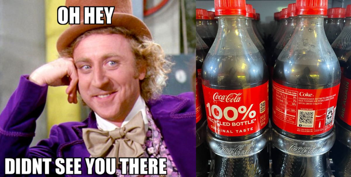
Coca-Cola is one of the most popular brands in the world. And it’s the most valuable beverage brand. It’s no doubt a trendsetter for the beverage category and no surprise they are an early adopter of QR codes.
Aside from the classic soda brand, the company has a portfolio of beverage brands including Sprite, Fanta, Dasani, Honest Tea, SmartWater, Minute Maid, Powerade, Costa Coffee, Fresca, Topo Chico, and Vitamin Water. Based on what we can see on shelves, many of these products have QR codes too.
Across all of their brands, Coca-Cola sold 30.3 BILLION unit cases of its products in 2020.
With these sales, Coca-Cola is running the largest QR code experience program in the world.
While this is great, Coca-Cola’s QR code experience is sub-optimal. Keep on reading to learn how you can do better than what they're doing.
Coca Cola's On-Packaging QR Code Experience
Despite putting a QR code on their bottle - the implementation has A LOT of room for improvement. They are making all the rookie mistakes.
Here are a few things Coca-Cola brand managers can do to make this experience shine.
Learnings from Coca Cola's On-Packaging QR Code Experience
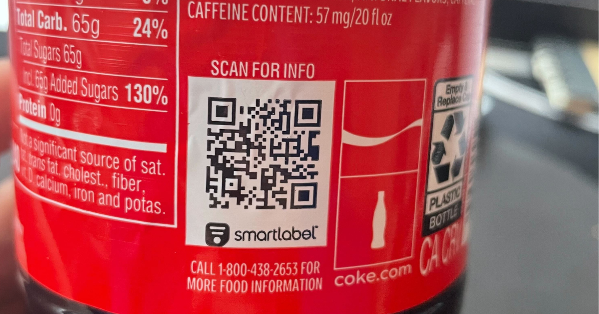
#1: The QR code is hard to find.
Granted this is a 16 oz. size bottle, but relative to the rest of the space the QR code doesn’t stand out. On 1- and 2-liter sizes, we need to make this larger. It gets lost with the UPC code and recycling logo.
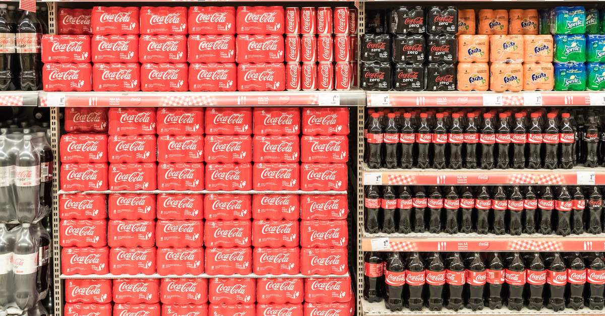
#2: The call to action is nonexistent or vague.
We’ve seen a few iterations out in the wild. Some just have the SmartLabel log with no call-to-action. Other’s that say, “Scan for more info.” What does that mean? Feels like it could be for the factory, shipper, or recycler. Some calls to actions which could improve this experience include the simplistic “Scan me” or adding a benefit to the consumer that entices them to scan.”
#3: The QR code has its own sub-brand?
Nothing wrong with this per se, but Coca-cola cedes branding and valuable real estate to a third party, Smartlabel. It dilutes the packaging and takes room away from the call to action. Props to Smart Label though, which has been championing QR codes since before it was cool.
A Brief History of Coca-Cola and QR Codes
We must have been living under a rock because Coca-cola has been tinkering with them for years!
Coca-Cola started using QR codes on its cans and bottles as early as 2011. The codes were used to provide customers with access to promotions, games, or other marketing campaigns.
In 2016, Coca-Cola started using SmartLabel QR codes in the United States. SmartLabel is a technology developed by the non-profit Consumer Brands Association (CBA) in 2015.
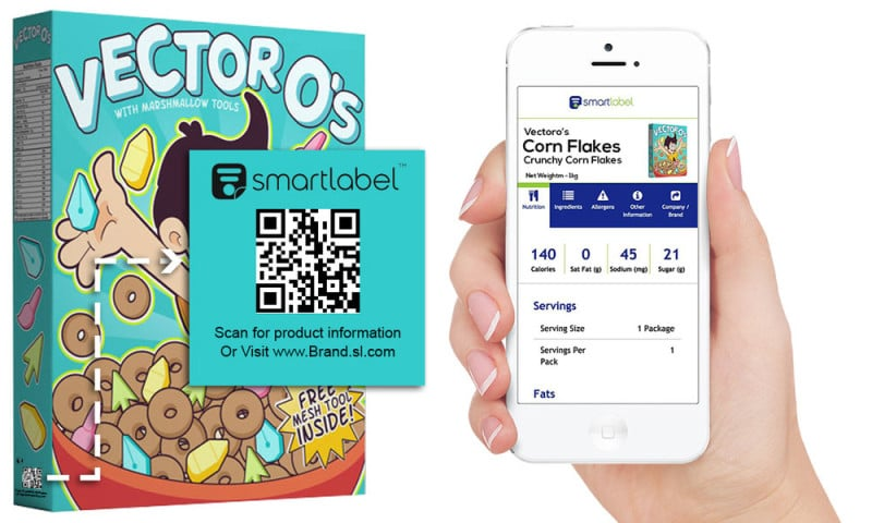
SmartLabel allows consumers to scan a QR code on a product to access detailed information about its ingredients and nutritional value, and other relevant details. It is more comprehensive than what is on a food label and has been adopted by many big grocery brands (such as xyz).
SmartLabel is a paid service. Pricing is dependent on the number of products and the size of the company. Costs could range from a few thousand dollars for a smaller company to hundreds of thousands of dollars for larger companies.
Coca-Cola was one of the early adopters of SmartLabel and by 2017, the company had added SmartLabel QR codes to many of its products sold in the United States.
Now on to the destination experience.
Coca Cola's QR Code Destination Experience
Learnings from Coca Cola's QR Code Destination Experience
#1: It has good content.
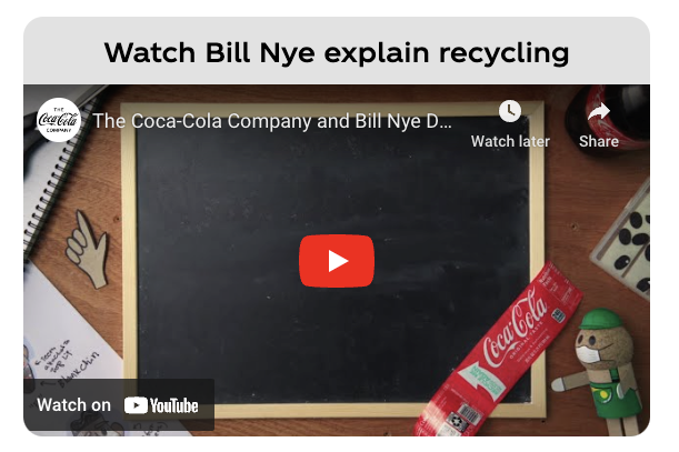
It’s value-added for a Coca-cola drinker. It contains nutritional value info and a video from Bill Nye the Science Guy about recycling. Who doesn’t love Bill Nye? And the focus on the environment is commendable. Great job on that Calling out the Bill Nye video, could be a create call to action for the QR Code as well!
#5: The landing page is Smart Label’s branding.
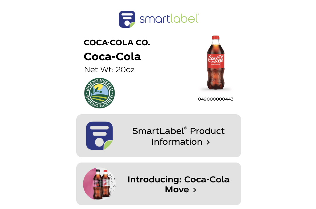
The landing page contains Smar Label's branding, rather than Coke’s. This is a huge missed opportunity. The Coke branding on the Smart Label page is non-existent. If you scanned another Smart Label for potato chips it would look exactly the same. It’s inconsistent with the Coca-Cola brand.
#6: The page lacks context.
That is a major missed marketing opportunity. From this QR code, we know exactly what SKU was bought. That provides valuable context for personalized marketing. However, the linking pages and recommendations are generic. Given you have this granularity of data, make recommendations that make sense for the product purchase.
#7: It is not mobile-optimized.
It’s similar to a Linktree and has too many choices. You have to scroll down to see everything when it could all fit in a single view. When you click out to the nutrition information page, it gets glitchy and hard to navigate and read. If this were mobile optimized it would make for a better customer experience.
#8: There are many external links.
This makes sense with the first stop being a SmartLabel URL. Will buyers even make it past the first CTA of going to Smart Label-powered nutrition info? There are then 5 sub-tabs to review. A good experience will keep people engaged, embed content directly, and keep people from leaving the experience.
#9: There is significant link redundancy.
There are two links to Coke US home pages. And two links to information about recycling recycle. You only need one for each.
#10: Linking to a home page is a cardinal sin.
When you have additional context like what was bought and where it was bought, it’s the perfect opportunity to provide a personalized experience. Bring some more fun BUT different content into the experience. Provide some related recommendations and promotions.
#11: The experience lacks marketing pixels.
With some pixels on this experience, Coca-Cola could be building massive retargeting audiences on Facebook and Google. With billions of bottles out in the wild daily, this could be the biggest pixeled audience in the world.
#12: The experience is not optimized for conversion.
This ties back to the purpose of SmartLabel. It’s really about communicating nutrition. If we are being honest here, people who drink soda don’t really care about that. However, this is an always on-channel that could be driving business growth, i.e. in-store rebates, coupons, contests, email list growth, or just cementing brand leadership with storytelling, video etc.
What Better QR Code Experiences Look Like
In short, it’s the opposite of everything above.
Tactically there are two parts to the QR Code Experience.
- The packaging design and call to action.
- The destination experience.
These two strategies are linked, but the first part is way easier to get right. Check out the difference between Coca-Cola and Dr. pepper. You don’t need to be a design genius to spot the difference.

Dr. Pepper has a great QR code placement. The QR code is front and center with a very clear call to action. Meanwhile, we had to rotate the Coca-Cola bottle and the QR code is sandwiched between the nutrition label and recycling certification with a hard to see call to action.
The destination experience requires a lot more thought and ultimately is tied to strategy decisions.
However, many of the brands that BRIJ works with are doing two things differently:
- Supporting business growth - Leveraging the QR code experience to drive critical goals like communicating brand differentiation, driving in-store sales, collecting customer data in a dark channel, or building their email list.
- Considering the user experience - What do they find engaging? What do they want the most? How do they like to consume it? What design is most likely to drive action?
Here is one example of what that could look like:
Coca-Cola QR Codes: There's Room for Improvement
In sum, we love that Coca-Cola, the leader in beverages, is using QR codes.
It’s one small step for the biggest brand in the world, but a major step for “CPGkind.”
We are confident this will improve in time. And we’re here to chat with anyone on the Coca-Cola team (and affiliated brands!).
Let’s all take note and follow in this amazing brand’s footsteps. And learn from their testing!
If anyone is interested in talking QR code experience strategy or wants to see how they can level up their QR Code experience with the BRIJ platform book some time with us here.


